A beloved country club community with deep roots and a storied past, Tamarisk Country Club sought to modernize their visual identity and communications while staying true to their heritage. We were honored to partner with them on that journey.
Our creative process began with a refinement of Tamarisk’s logo and corporate identity. The goal wasn’t to replace what had come before—it was to evolve it. We updated the mark for greater clarity and versatility across print and digital platforms, while preserving the spirit that long-time members had come to know and love.
From there, we applied the refreshed identity across a corporate package, including stationery and signage. Every piece was designed with consistency and sophistication in mind.
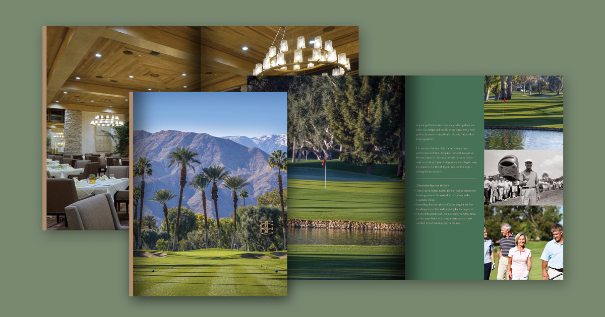
To showcase what makes life at Tamarisk so special, we developed a membership brochure—both print and digital—that highlighted the club’s premier golf experience, strong sense of community, and vibrant social offerings.
From creative strategy and copywriting to art direction and layout, our team brought Tamarisk’s story to life with warmth, elegance, and clarity. The visual aesthetic complemented the landscape and architecture of the club itself—classic, serene, and inviting.
Alongside the creative work, we also supported Tamarisk’s team with public relations efforts to help expand awareness and reinforce the brand within the community. Strategic messaging and media outreach helped tell the story of a club proud of its past and confident in its future.
While this project was completed some years ago, it remains one of our favorite examples of how timeless design and thoughtful collaboration can revitalize a legacy brand.
At Hunter|Johnsen, we specialize in helping organizations honor where they’ve been—while positioning them for where they’re going.
If you’d like to find out more about what we can do for you, we’d love to hear from you. Connect with us here.